Creating a peaceful and relaxing atmosphere in your home often begins with the colors you choose for your walls, furniture, and accessories. Calm colors have a soothing effect on the mind and can help reduce stress while making your living space feel welcoming and cozy. If you’re thinking about refreshing your home’s look with tranquil hues, this guide will help you choose the perfect calm colors and use them effectively.
Why Choose Calm Colors for Your Home?
Calm colors generally refer to soft, muted shades that evoke a sense of peace and relaxation. Unlike bright or overly saturated colors, calm tones don’t overwhelm the senses, making them ideal for spaces where you want to unwind, focus, or enjoy quiet moments. Whether it’s a bedroom, living room, or a cozy reading nook, calm colors set the right mood.
Popular Calm Color Choices
Here are some common calm colors and the feelings they often inspire:
– Soft Blues: Known for evoking a sense of tranquility and stability. Blue is excellent for bedrooms and bathrooms.
– Muted Greens: Bring the freshness of nature indoors and have a relaxing, rejuvenating effect.
– Gentle Grays: Versatile and modern, light grays add a peaceful backdrop without feeling dull.
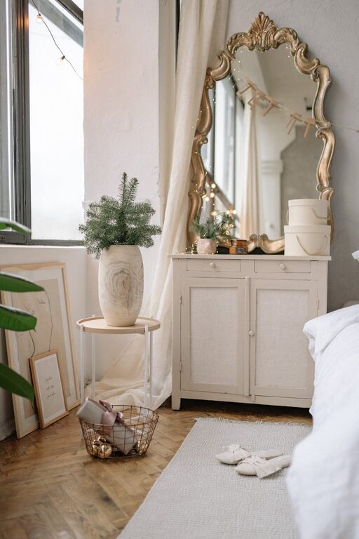
– Warm Neutrals: Beige, cream, and soft taupe offer a cozy, inviting atmosphere.
– Lavender and Soft Purples: These can offer subtle calmness with a hint of creativity and luxury.
Tips for Choosing the Right Calm Colors
1. Consider the Room's Purpose
Think about what the space will primarily be used for. For example, soft blues and greens are great for bedrooms as they help with sleep and relaxation. Living rooms can benefit from warm neutrals or gentle grays that encourage conversation and comfort.
2. Test Colors in Different Lighting
Colors can look very different depending on natural and artificial light at various times of the day. Always test paint samples on your walls and observe the color in morning, afternoon, and evening light. This helps ensure you’re happy with the hue throughout the day.
3. Use Color to Create Harmony
Stick to a cohesive color palette to maintain a calm and balanced feel. Typically, choosing two or three complementary calm colors for the room helps create harmony without overcrowding the visual space.
4. Balance with Neutrals and White Space
Calm colors often work best when paired with whites or lighter neutrals to keep the room feeling airy. If a calm color feels too heavy, balance it out with plenty of white trim, ceilings, or furniture.
5. Incorporate Texture and Materials
Colors alone aren’t enough to achieve a calm environment. Incorporate soft textures like cotton, linen, or wool in pillows, rugs, and curtains. Natural materials like wood and stone can deepen the sense of calm.
6. Don’t Forget Accent Colors
Adding small pops of deeper or contrasting colors can prevent the room from feeling flat. For calm environments, opt for muted accent shades like dusty pink, slate blue, or soft gold.
How to Apply Calm Colors Throughout Your Home
Walls
Paint is the most impactful way to set the mood. Choose wall colors that encourage relaxation. For example, pale green in a bathroom or soft blue in a bedroom.
Furniture and Upholstery
Consider sofas, chairs, or beds in calm hues. Upholstery in muted tones can anchor a room and add comfort without overpowering the space.
Accessories
Add curtains, throw blankets, and cushions in calm shades to tie the room together. These elements are also easy to change if you want a refresh later.
Art and Decor
Choose artwork featuring calm colors or natural scenes to complement your color choices and enhance the atmosphere.
Common Mistakes to Avoid
– Going Too Dark: Deep calm colors can sometimes feel gloomy if the space lacks natural light.
– Neglecting Testing: Skipping paint tests on multiple walls or at different times can lead to disappointment.
– Ignoring Contrast: A room of just one calm color can look flat—introduce different shades and textures for depth.
– Overloading Patterns: Too many busy patterns can disrupt the calm effect, so choose simple, understated designs.
Final Thoughts
Choosing calm colors for your home is an excellent way to create a peaceful retreat from the busyness of everyday life. By considering the room’s function, lighting, and complementary elements like texture and accents, you can create spaces that are both stylish and soothing. Take your time testing shades and building your palette to enjoy a home that truly feels like a calm oasis.
—
We hope these tips inspire you to experiment with calm colors and transform your home into a serene and welcoming environment!